Website Redesign for
American Multiservices
| UX/UI
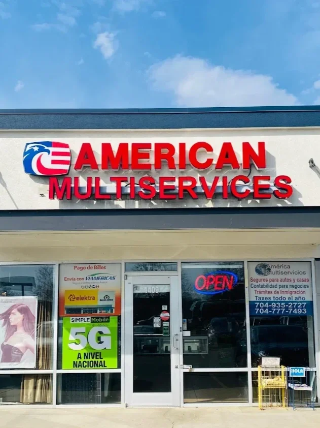
American Multiservices is a small family-owned business with over 20 years of experience in Charlotte, NC. They are committed to assist the community with various tasks and formalities including Tax filing, Insurance, Bookkeeping and Payroll Services. But their website has limited functionality and do not allow current and potential customers to connect properly with the business and its resources.
Project Overview
Understanding the Problem
American Multiservices has built a loyal customer base over the years, with many clients becoming loyal participants since the very beginning. However, in today’s digital world, relying solely on word of mouth isn’t enough to drive consistent growth and attract new clients.
80% of users that land into the website are new visitors and 20% recurrent ones.

61.7% of users leave the website without completing any action.

The average session of a user lasts only 4 minutes.

Out of 5 people who requested more information through the website on 2024, only 1 visited the office.

The Process
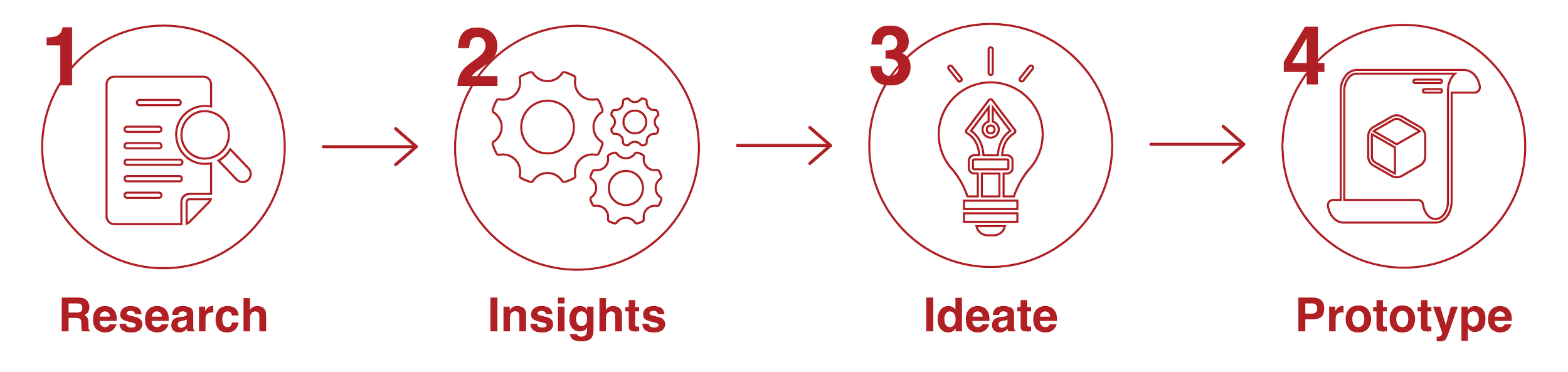
User Interviews
-
![Smilling woman]()
"Their website does not feel welcoming. It actually looks unprofessional. I would like for it to motivate me, and make me excited to use their services".
-
![Older man with grey beard and hair smiling]()
"I have to be constantly calling to verify what I need to complete the service, I wish I had them handy so I can reference whenever I need"
-
![Smiling young woman resting her chin on her hand]()
"There are not any actions to complete on the website. It leaves me feeling like I am actually missing important information, unsatisfied."
-
![Young person smiling casually with headphones around their neck.]()
"It just feels outdated, old and drained of life! It is very uninviting. It doesn't make me engaged or intrigued to know more about the business"


Insights & Assumptions Confirmed
Based on the user interviews, desk research, and affinity mapping, we were able to identify the most important insights and crucial points that we need to take into consideration for the design of the new website. These findings guided the development of a user persona, journey map, and flow diagram, which will further help us validate our initial assumptions.
-
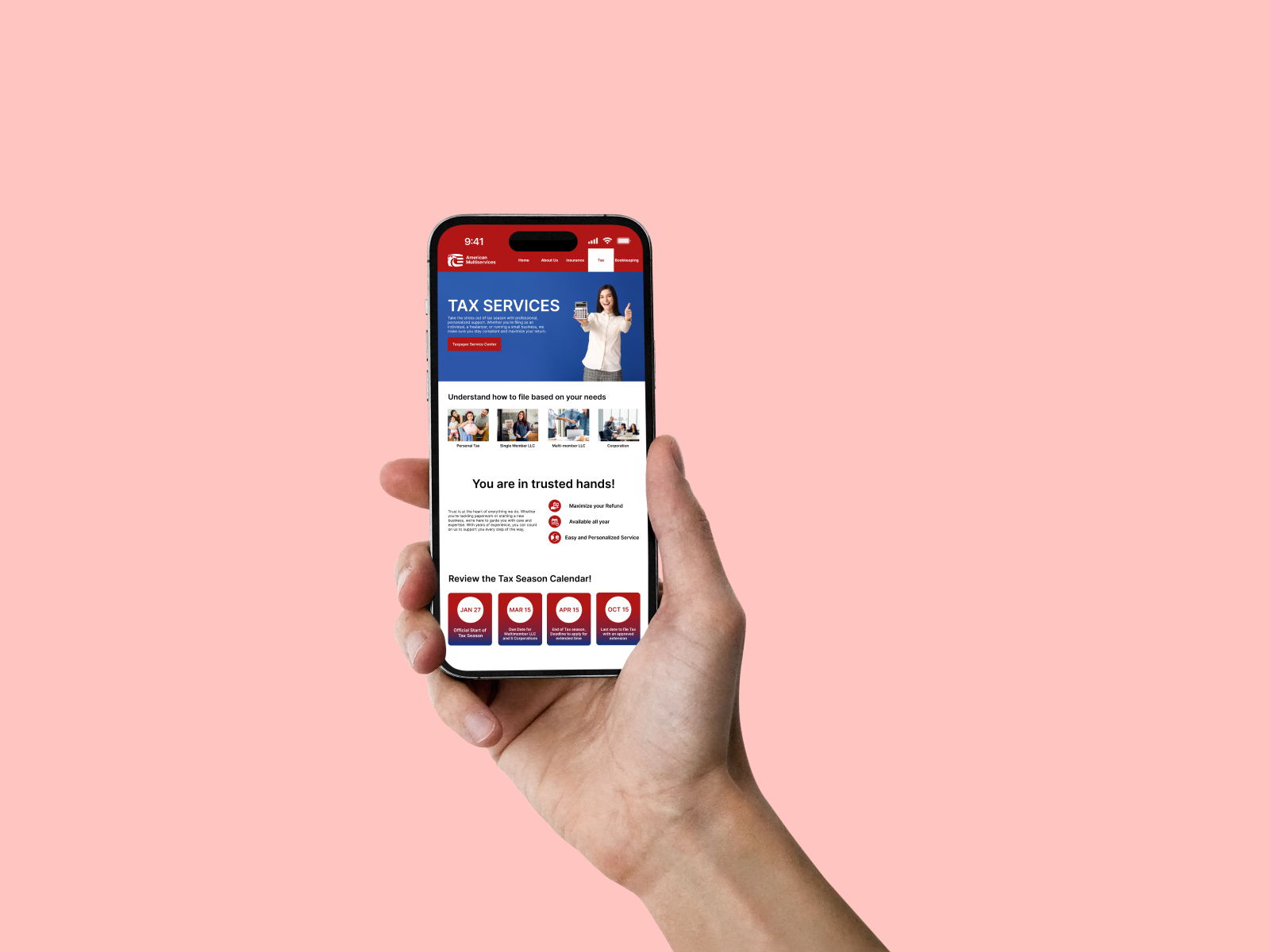
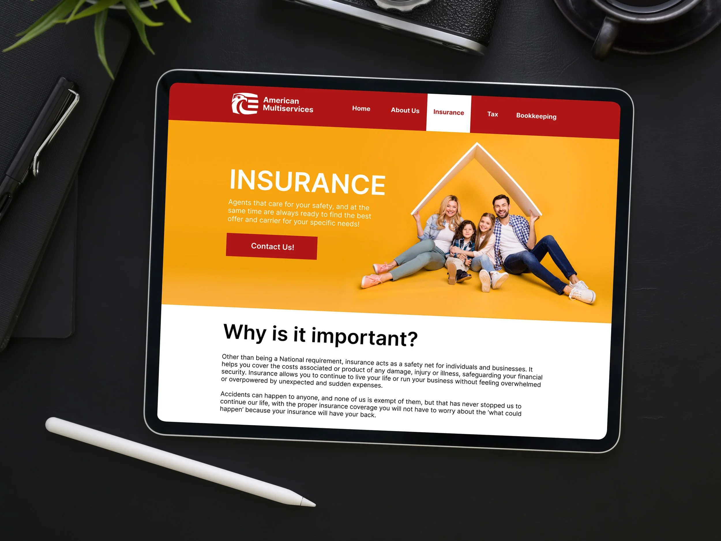
The website’s purpose must be to offer basic information about their services, so that clients can properly identify their specific needs and be directed to the business, having a clear base of what they need and how the company can help them.
-
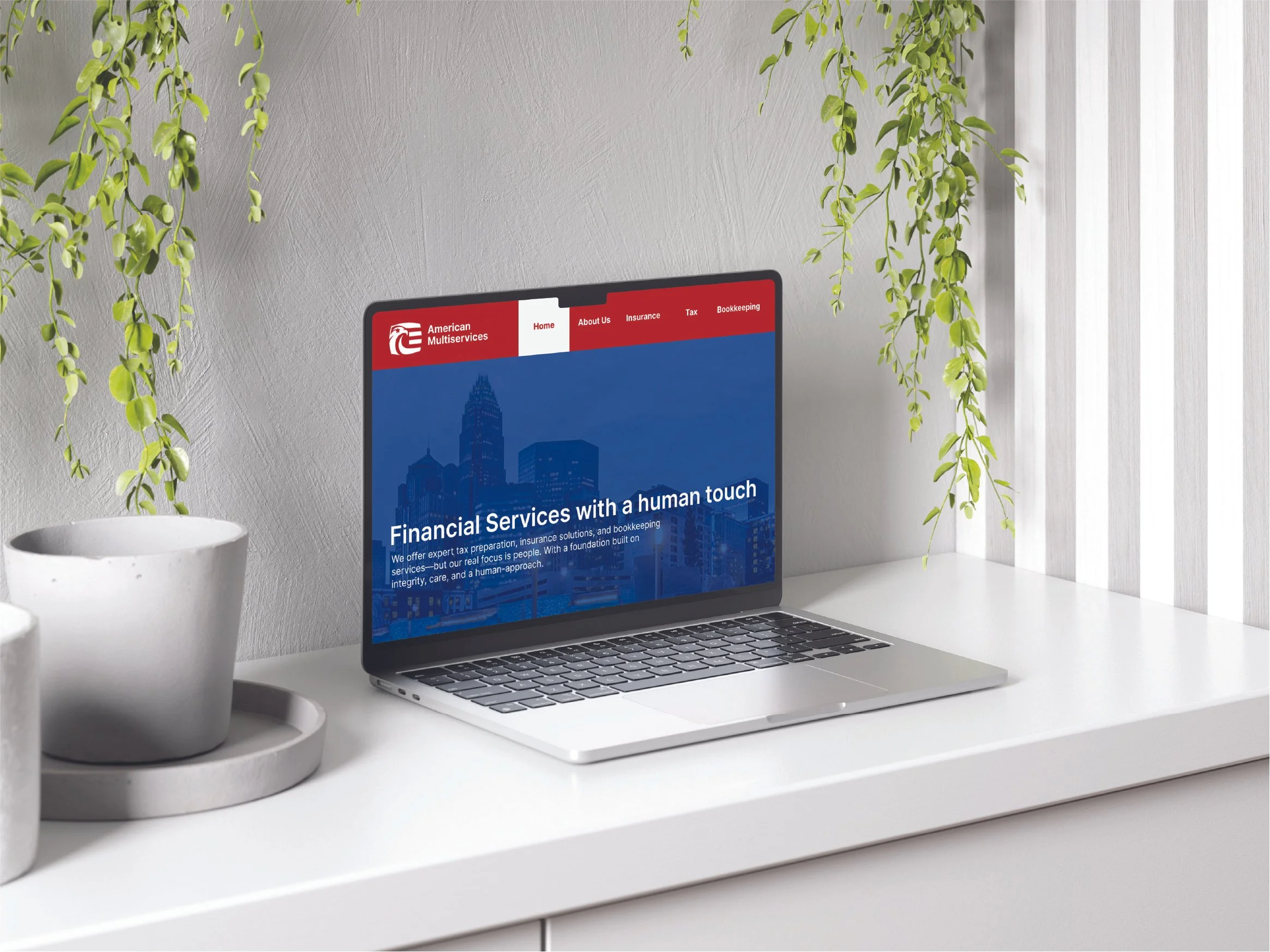
The new website must be eye-catching while remaining professional and accessible, evoking trust and reliability. It must clearly express the values of the business and convey a strong sense of community and service.
-
The website must give users a clear purpose for returning and engaging with it. It should provide meaningful tools and resources that users can access at their own pace, empowering them to take action and find value in the experience.
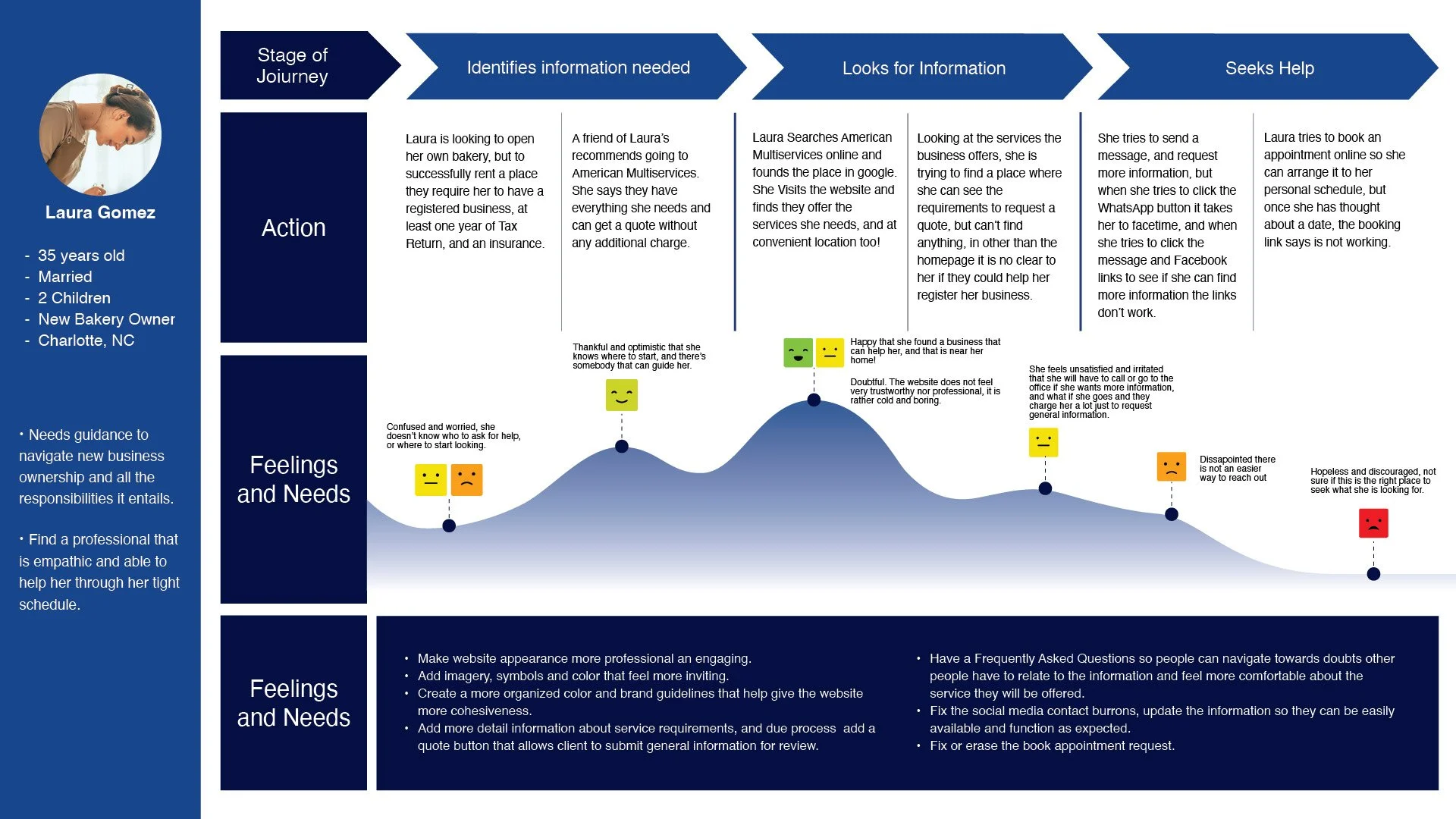
Persona
Name: Laura Gomez
Age: 35 years old.
Status: Married with two children.
Occupation: New bakery owner.
Location: New Resident of Charlotte, NC.


“I just moved to Charlotte, NC, and need someone who can guide me through starting a business and filing taxes”.
Goals:
Find a reliable specialist that I can trust to handle my personal information. Someone who is empathic and won’t judge if I don’t have knowledge of the process of tax filing, insurance, or business handling needs.
Experiencing Current Product:
A friend of mine recommended American Multiservices. After searching online, I noticed they are in a convenient location, but their website did not offer many insights about what to expect or what I would need. I tried making an appointment online, but was unsuccessful. I had to call the offices, and the lady on the phone seemed very understanding and helpful! I wish their website reflected that.
Behaviors and Habits
Laura moved to Charlotte about 6 months ago. She is on a mission to start her own bakery business. Right now, she works 6 days a week, making pastries, bread, and other treats from home. Because her husband has a full-time corporate job, she has to drop off, pick up the kids from school and make dinner for the family. Sundays are for spending quality time with family. Laura knows how to handle herself online; she even has her own website, but due to her tight schedule and lack of knowledge of the area, she is still figuring out this whole business-owner thing.
Journey Map
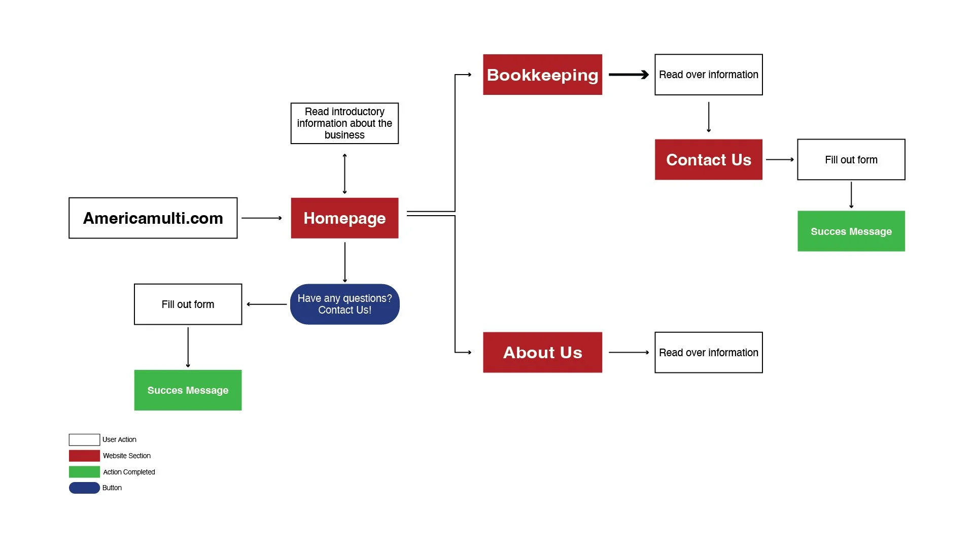
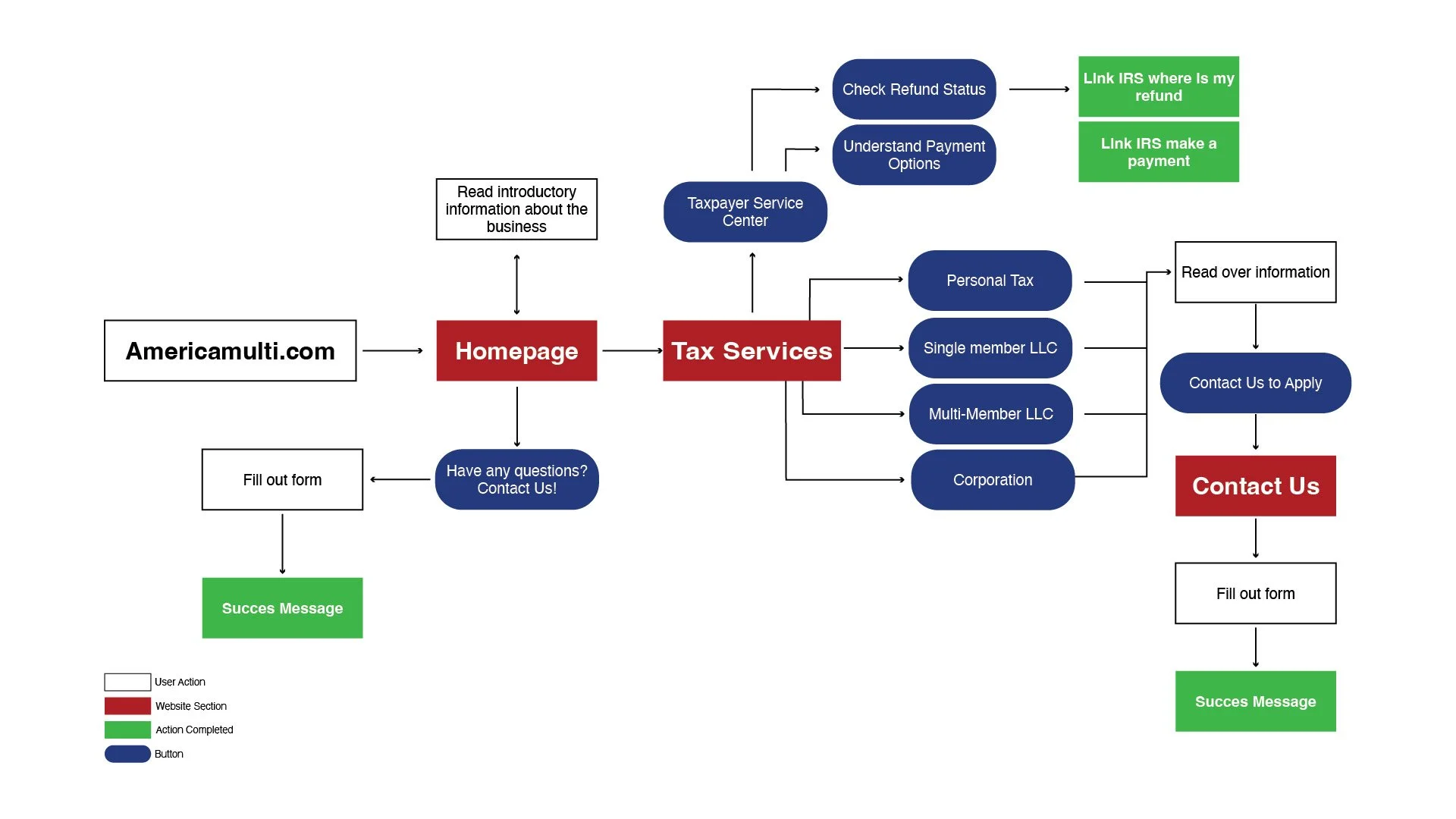
Sitemap
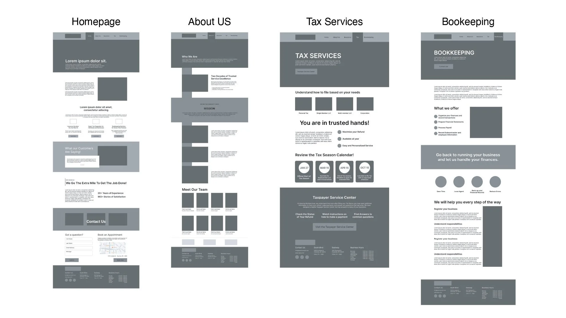
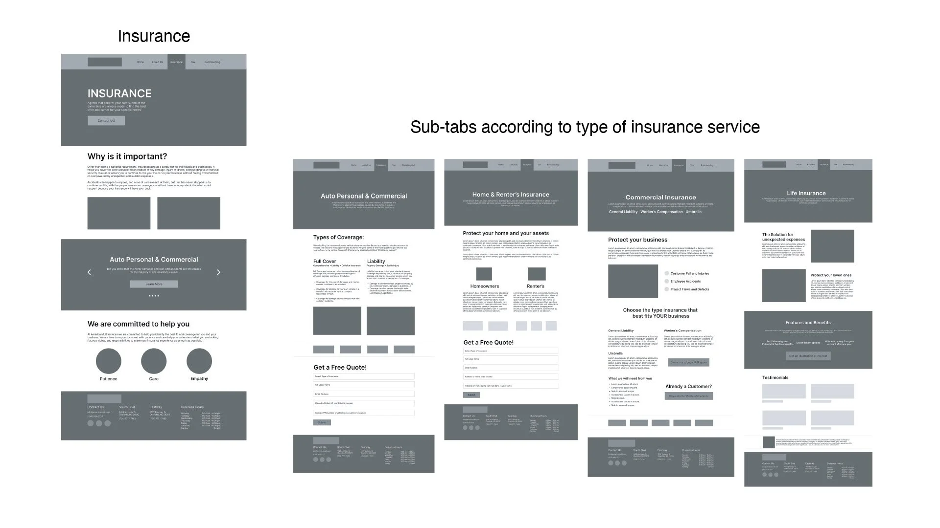
Upon completion of the research and UX analysis, the next step of ideation was introduced with the development of a sitemap that would help understand and shape the type of content, sections, and tools that should be used to develop a consistent design and to ensure an accessible and more engaging user experience.
Flow Diagrams

Low Fidelity Wireframe
Design System
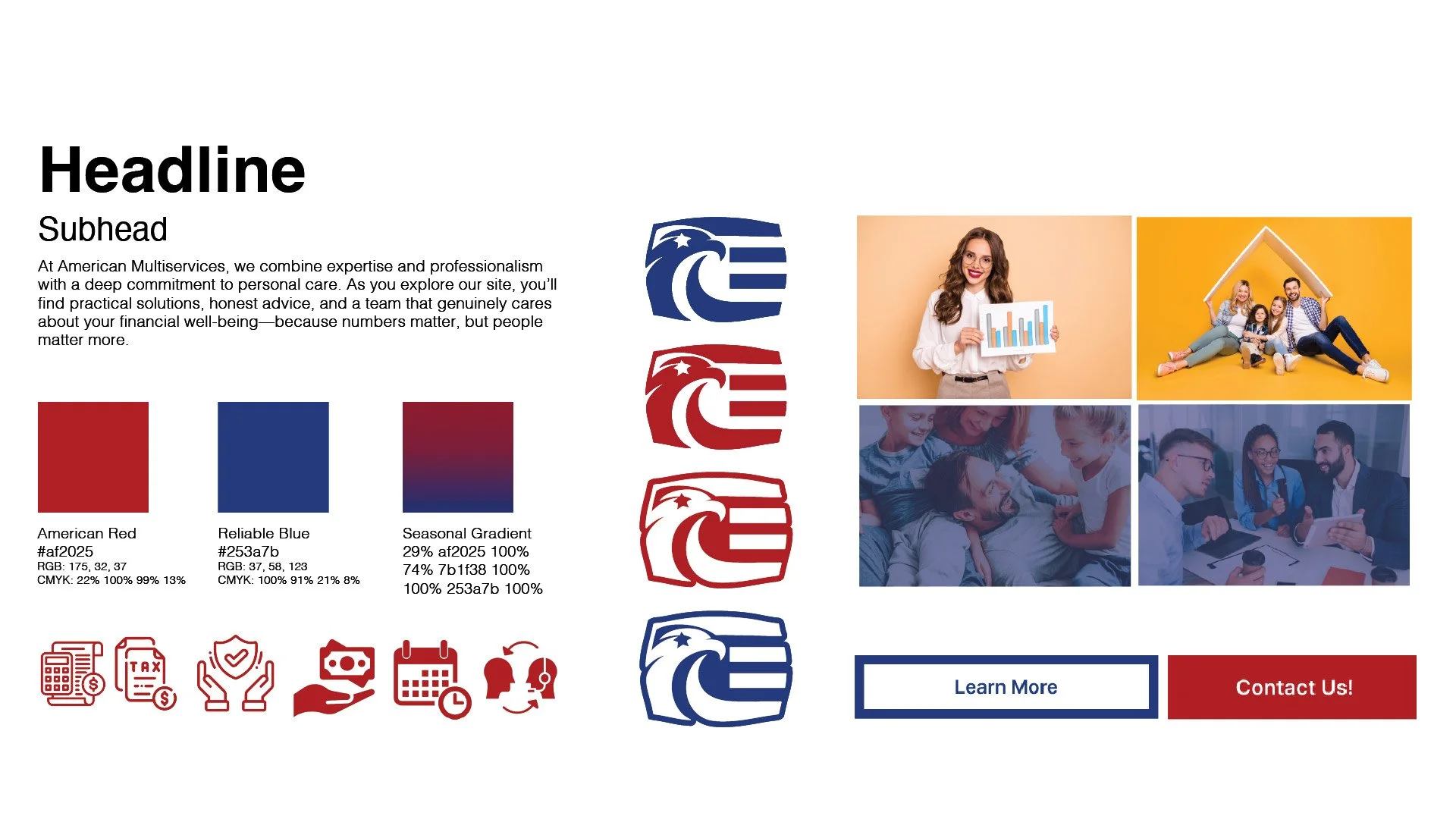
The Website’s Design system sets a standard that ensures that all the website assets are cohesive and personalized to American Multiservices. It maintains the essence of the business's original branding, while focusing on showing a relationship of trust and community