Winter Olympics 2034 -Harbin, China
| Branding Design
Project Overview
The Winter Olympics exemplify the peak of human athleticism, and every four years, a selected country becomes host to over eleven thousand competitors as they participate in 109 events over two weeks. During this time, the host country’s culture, creativity, technological achievements, and geographical beauty are on display to the world.
The goal of this project is to develop a branding proposal that includes a logo, icons, signage, apparel, medals, and mascot that represent Harbin’s culture, geography, and historical achievements, while translating and respecting traditional Olympic brand elements and values.

Balance
Harbin is located in the Northeast of China and is considered the center of politics, economy, and culture for its vast diversity
Growth
Harbin was a fishing village. With the construction of the Eastern Railway, it became the region’s industrial base and shipping center
Unity
Known as the “City without walls,” Harbin has embraced different cultures with open arms. It is a place where religions collide and live in harmony.
Power
Harbin has the world’s largest ice and snow festivals, featuring life-sized sculptures that show the power and determination of its people.
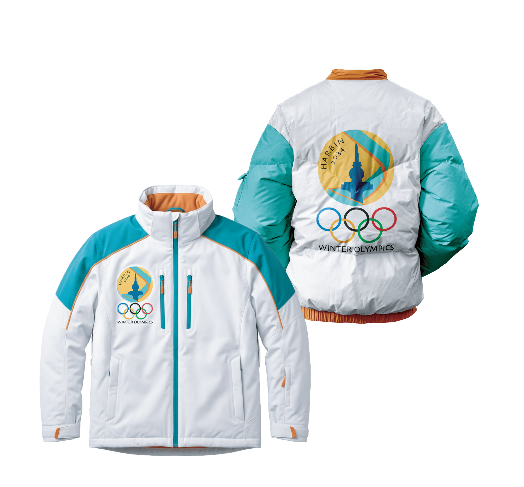
Logo
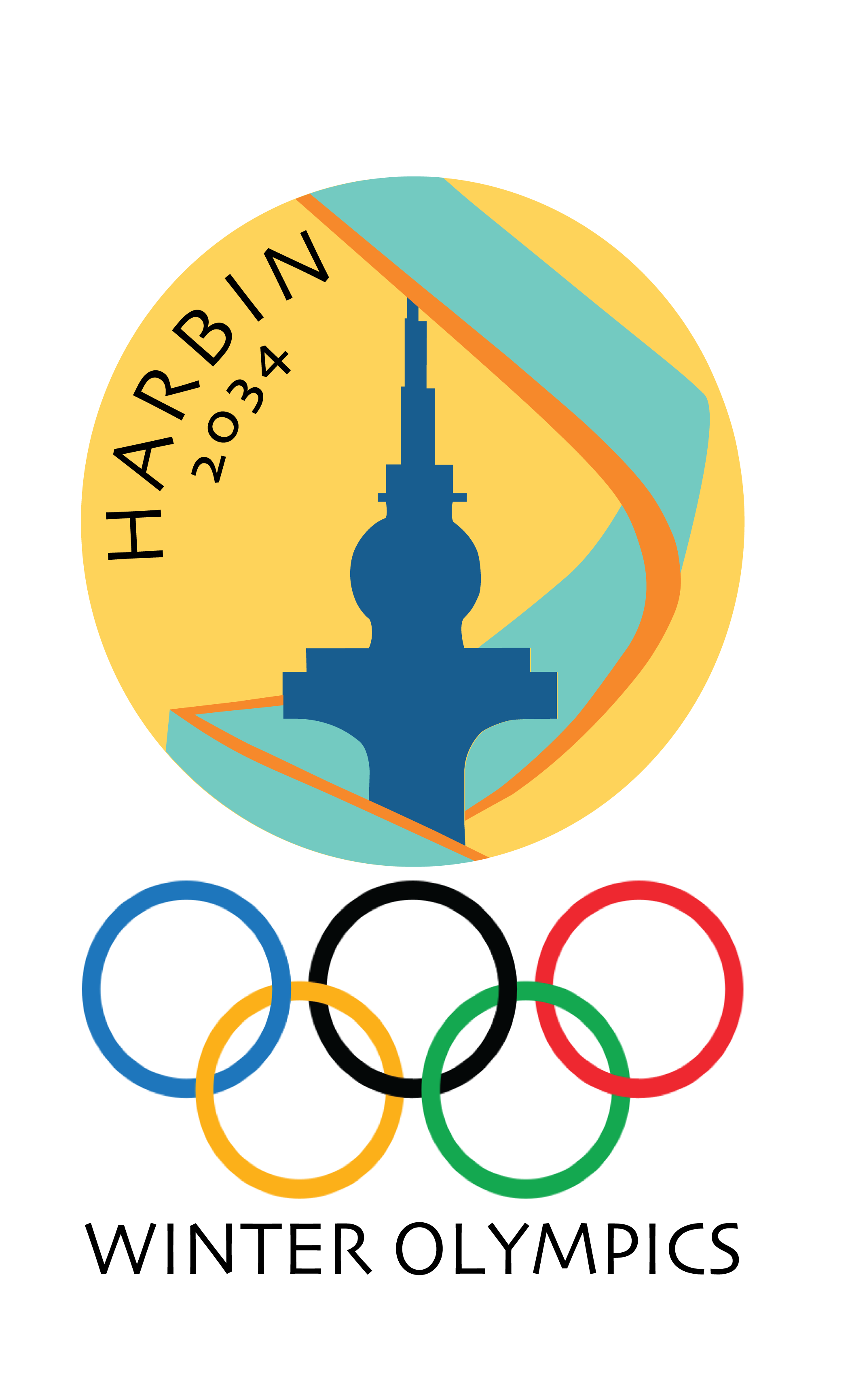
The Dragon Tower:
Cultural landmark & symbol of development, growth and technological advancement.

Medal Ribbon:
Symbol of the excellence discipline and resilience of the athletes.

Sun:
Nod to the Sun Island, pride of the locals and heart of Harbin’s winter celebration. It is a symbol of their history as a “city without walls’’.

Color Palette

Typography


Insights
The branding for Harbin’s 2034 Winter Olympics proposal was designed to highlight and transmit the city’s core values: community and tradition. It is meant to convey action, energy, and the beauty of winter, while making it warm and welcoming.
The logo was drawn with inspiration from Harbin’s Dragon Tower, a renowned landmark and cultural symbol. The ribbon wrapped around the tower embodies the achievements of every Olympic athlete, but also represents Harbin’s own history of growth.
Sport Icons
-
![]()
冰壶
Curling
-
![]()
高山滑雪
Alpine Skiing
-
![]()
花样滑冰单人滑
Figure Skating Single
-
![Icon-for-figure-skating-pairs]()
花样滑冰双人滑
Figure Skating Pairs
-
![]()
冰球
Ice Hockey
-
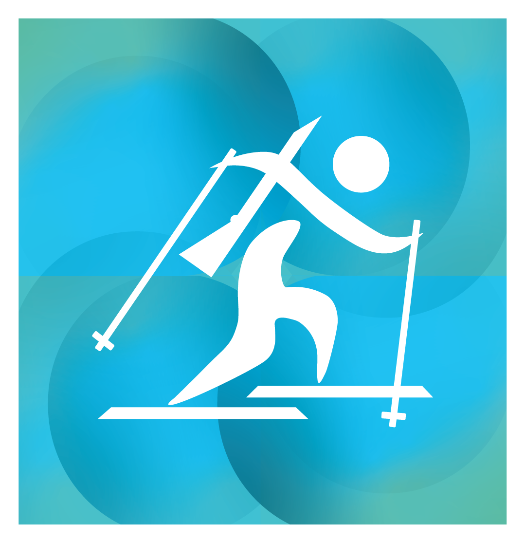
![A stylized white figure of a person hiking or climbing, holding trekking poles, set against a blue and teal abstract background with circular shapes.]()
冬季两项
Biathlon
-
![Abstract background with curved shapes and a white stylized swimmer icon.]()
滑雪板
Snowboard
-
![Stylized white illustration of a person surfing on a wave set against a blue gradient background with circular abstract shapes.]()
跳台滑雪
Ski Jumping


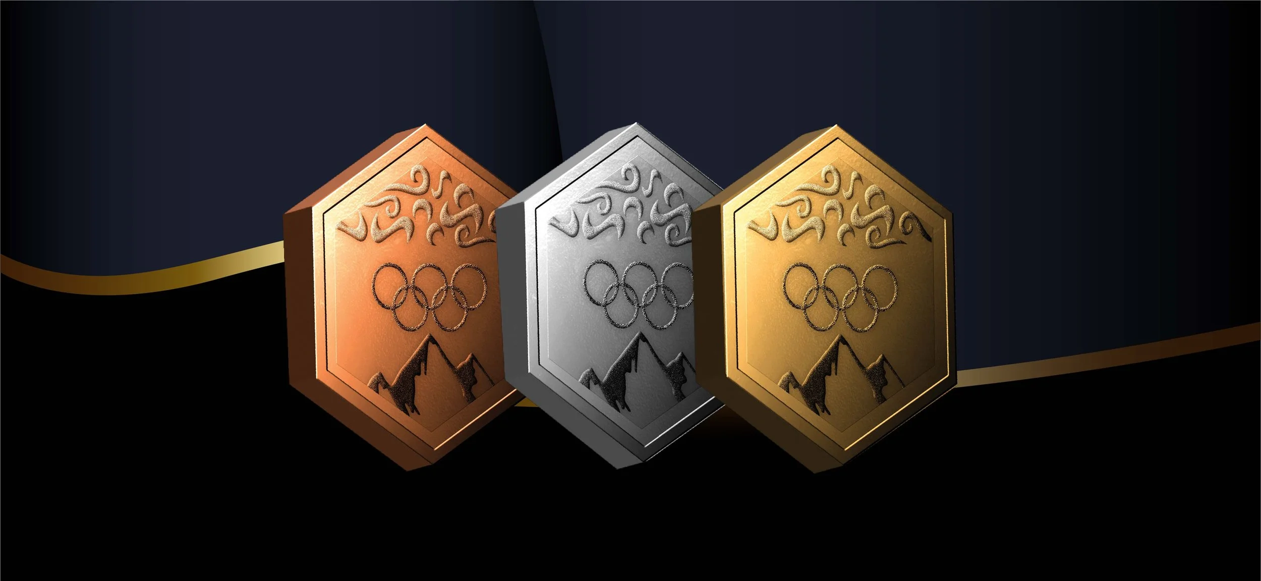
The hexagonal shape was chosen to symbolize perfect balance, a core value that serves as a reminder that talent must be paired with discipline to achieve greatness. It also conveys a message of openness and unity, encouraging the growth of cities without walls, where peace and acceptance guide how we interact with one another.
The medal has three main elements: A traditional Chinese pattern, a mountain silhouette, and the Olympic rings, which altogether are meant to evoke the spirit of connection. It celebrates both individual and collective harmony. It reflects a vision of Harbin as a city that embraces its traditions while opening itself to the world.

Nature
⁎
Healing
⁎
Peace
⁎
Courage
⁎
Nature ⁎ Healing ⁎ Peace ⁎ Courage ⁎

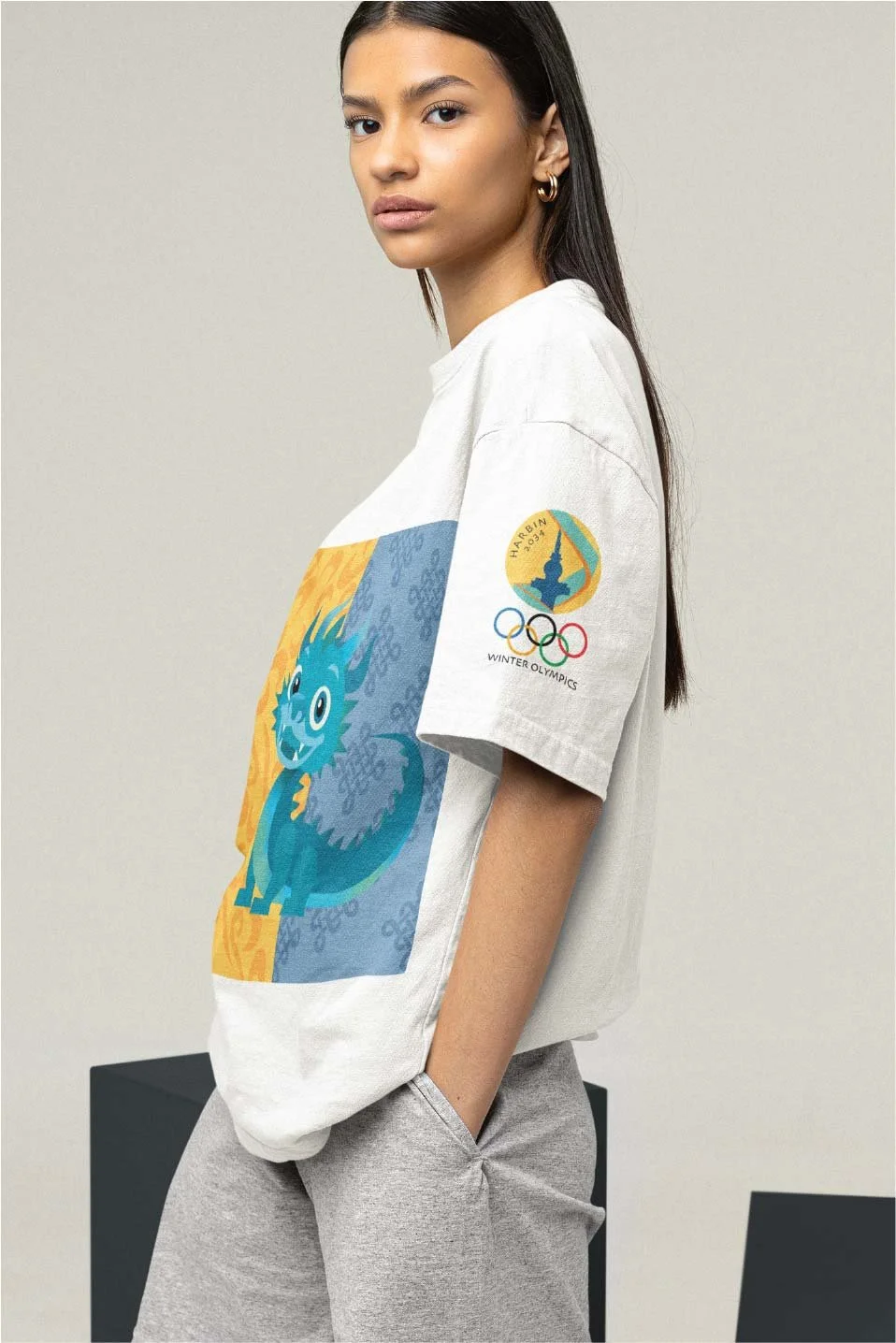
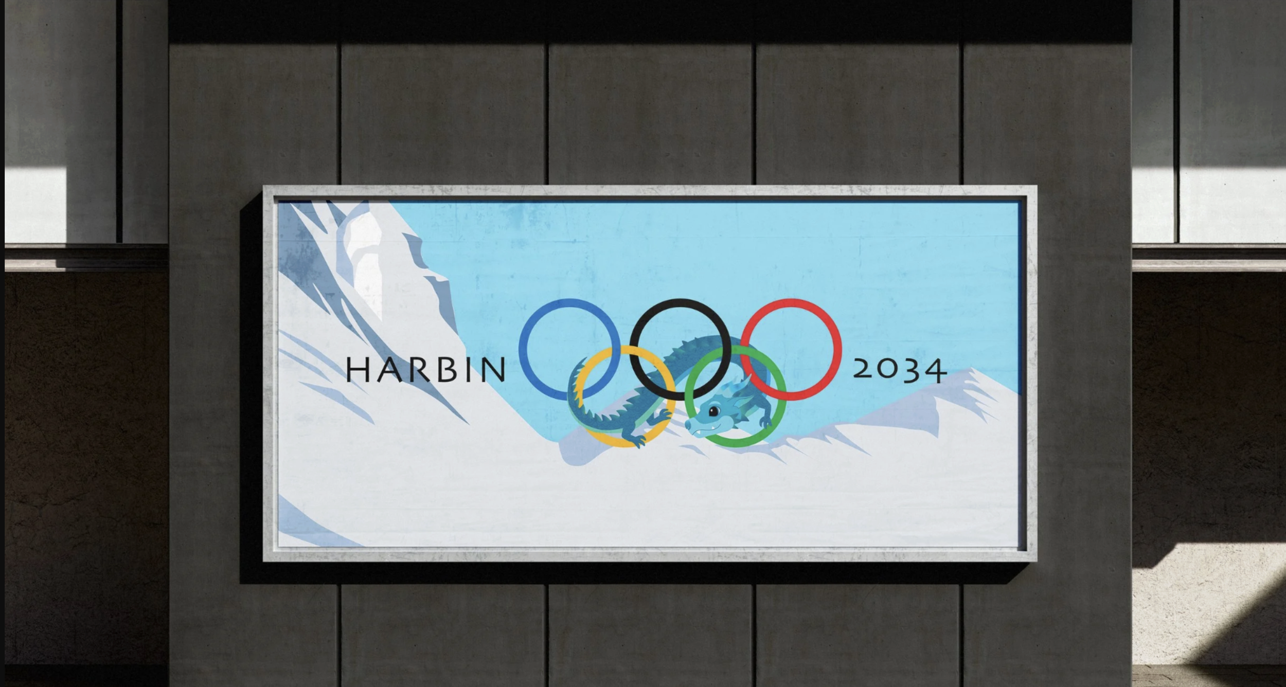
KAI YONG
Born from the icy mist that rises over the Songhua River, Kai Yong is a young dragon who embodies nature, healing, and peace. His shimmering blue scales reflect the sparkling sculptures of Harbin’s world-famous Ice and Snow Festival.
Kai Yong loves to glide through the snowy mountains, watching locals and visitors ski, laugh, and celebrate the season together. With a courageous heart, he is always excited to make new friends and share the magic of Harbin’s winter landscape.
As a mascot, Kai Yong represents the city’s harmony between culture and nature. He celebrates Harbin’s traditions, northern beauty, and warm community spirit.