| Branding Design
POLAR

Project Overview
Polar is a Norwegian cosmetics company that values honesty, reliability, and vitality. They offer skin-care products that are rich in nutrients and cruelty-free
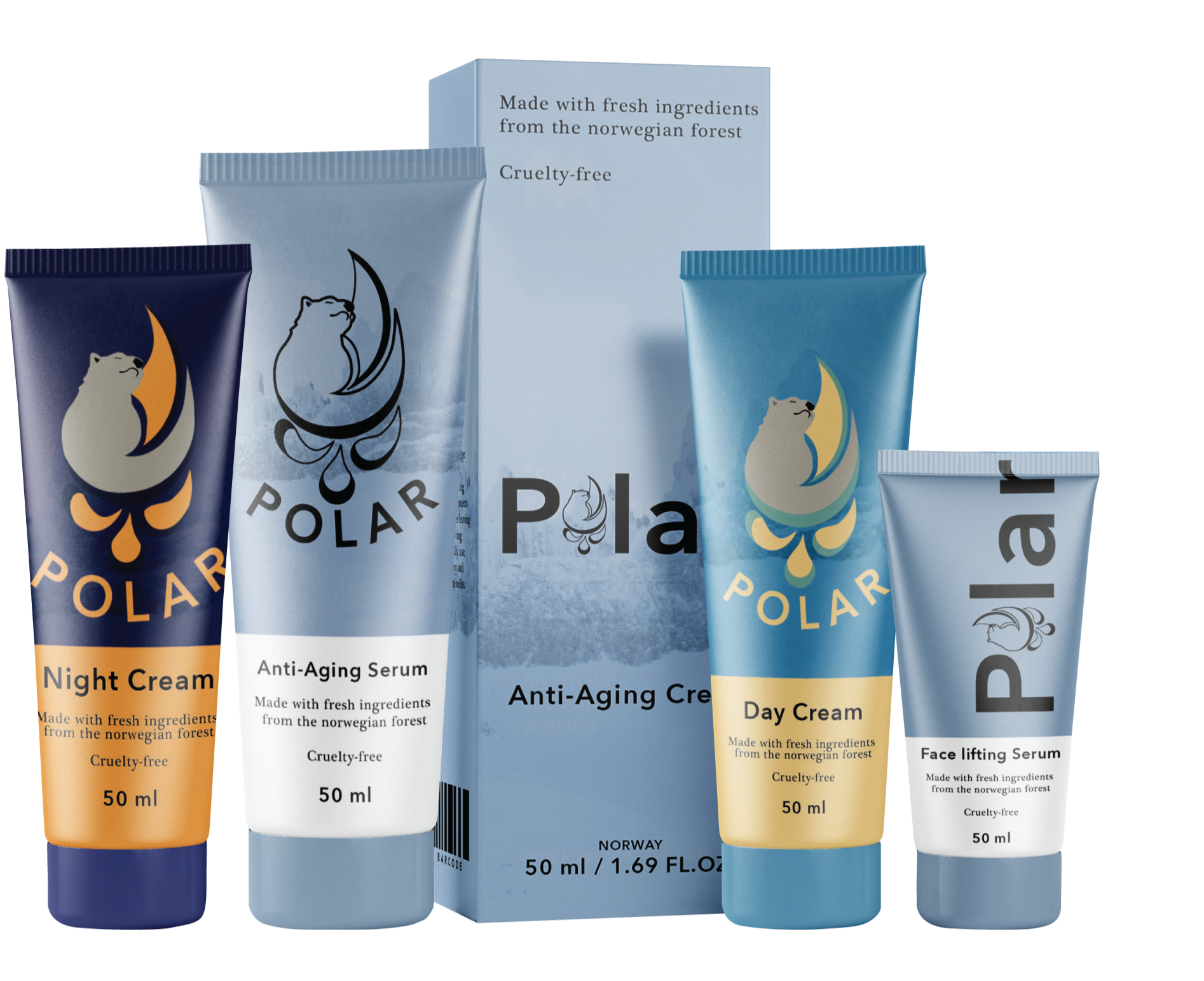
The goal of the project was to create an eye-catching branding and primary packaging design that appeals to their broad audience and evokes a sense of vitality and replenishment.
Logo System

Primary Logo

Secondary Logo

Logomark
Insight
The primary goal with Polar’s brand was to create an image that felt refreshing, reliable, modern, and reflective of the high quality of their products.
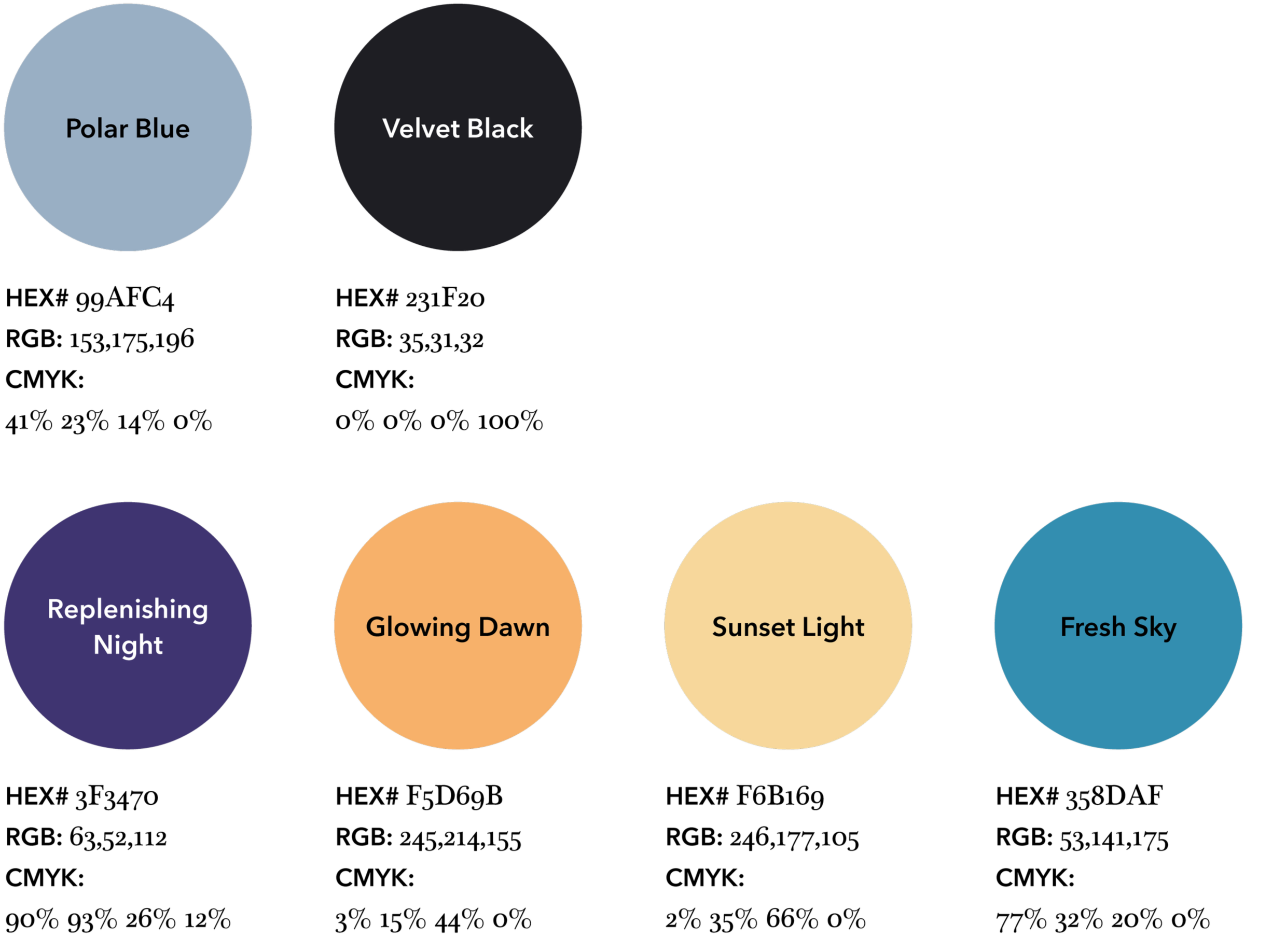
The resulting brand identity closely aligns with the company’s core values and aims to honor the company’s origins by making use of traditional imagery and colors of the natural landscape of Norway. The brand’s main color palette was designed to reflect the elegance of minimalistic cosmetic products to appeal to the brand’s mature audience. In contrast, the day and night sets feature more vibrant colors that help the customers easily differentiate the sets, and their vibrancy is meant to engage and connect with a younger audience.
Color Palette

Typography


Embrace the Power of Nature!
Infused with pure, revitalizing ingredients and wrapped in the spirit of the Arctic, our products hydrate, soothe, and revitalize your skin.

